Tuesday 4 April 2017

Rationale


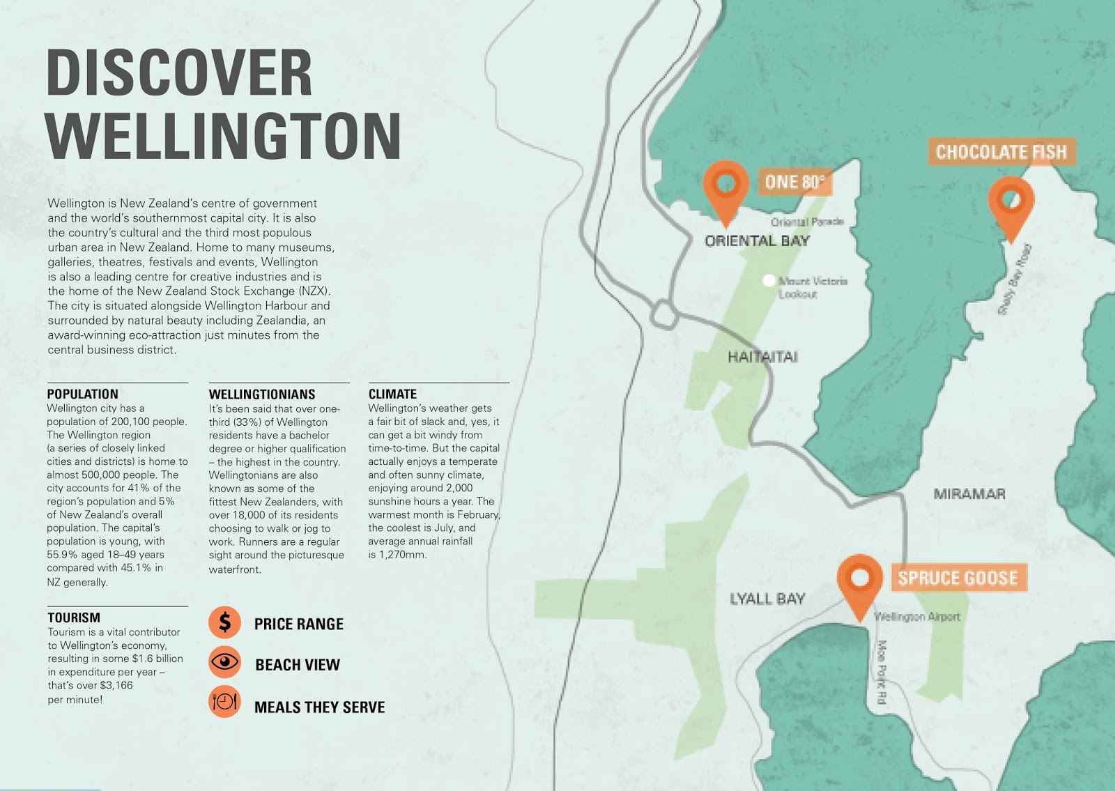
My locations for my brochure include three seaside eateries, including the Chocolate Frog, Spruce Goose, and One 80° restaurant. I decided to make the price that differentiates my locations. They range from cheap, mid-range to costly. This way, each site offers a range of experiences and showcases a different beach. For my visual approach, I wanted to convey a bright and clean atmosphere. To achieve this, I layered elements together so that my design communicates both the cafe and beach theme. I also included imagery of the beach, people, seafood and fresh ingredients. I made sure to have a consistent color palette, grid layout, and font that is easy to read. Throughout the making of my brochure, I had to keep adjusting my illustrations, so that there is a difference between each location and that it fits the vibe of the cafe. If I had to do something differently, I would've experimented more with my visual approach by including different imagery, colors, and grid composition to see how it would communicate a different vibe.


Kasina Lim 

Monday 3 April 2017

Week 6 Session 1

Week of hand in.

After printing out a few tests, I noticed that colors printed out a bit darker. Nothing too obvious, but I would like it to be lighter. 

When I did a test print with a higher quality paper, the colors were surprisingly different. The main thing I noticed was that the teal color printed out a lot greener than I expected. While it doesn't look bad, I would much prefer the color to be more on the blue side so that it relates more to the ocean.

Monday 27 March 2017

Week 5 Session 2

I printed out my brochure in it's actual size and stapled it in preparation for critique. Since I printed it off on another computer, it doesn't show the Univers font and used a default font instead. It also printed out darker than I expected so that's something I need to keep in mind when I'm printing my final brochure. I may need to lighten up the background.


I need to refine some details such as removing hyphenations, making sure the heading size is consistent throughout and kern my headings. One key element that Mark pointed out that was that my cover page only covered information for One 80. I need to include more elements that relate to Spruce Goose and the Chocolate Frog. He also pointed out that my cover page doesn't showcase all the colors in my spreads as it's only blue, black and white. I could include oranges, reds or greens to match the color palette inside the brochure. He also pionted out that I might not need to have the rocks on the Spruce Goose spread to extend across the spread. Though I quite like how it's a different composition than the Chocolate Frog and One80 because it makes my spreads not so repetitive. I could decrease the size of the rocks so that it's not so obvious.


For my cover page, I included more imagery that relates to Chocolate Frog and Spruce Goose. I definitely think it communicates my 3 locations better.


Week 5 Session 1


I've decided on my three final illustrations to use for each location. I roughly arranged my spreads side by side so that I have a clear look at how they work as a whole.


The main feedback I received today is to make sure that my illustrations are different enough and that they communicate the vibe of each location. For Chocolate Frog, my collage doesn't communicate the relaxed vibe the cafe offers. I can include photographs of the actual place, kids on their bikes or people eating next to the beach to communicate the cafe's vibe.

Other things I need to change:

- I want to change the color of the Chocolate Frog, Discover Wellington, and Food and Drink spreads so that they match the other 2 spreads. Although Lee said it might be a good idea to have a variety of blue shades so that it doesn't look so repetitive.

- Change the location headings to white so that they all match.

- Decide where my communication points will be placed.

Sunday 26 March 2017

More brochure developments


A few brochure drafts 

  • I experimented with asymmetrical compositions. 
  • I tried out a different heading font to convey a more casual mood. I also incorporated the heading with my collages, rather having it on a separate page.  
  • I used more vibrant colors to communicate a more energetic mood. 


Tuesday 21 March 2017

Week 4 Session 2


Today we worked on our maps. We quickly sketched up our current map on a piece of napkin to see if others could follow it. Looking at my map I made through photoshop, I think you can clearly identify how far apart my 3 locations are. Since my locations are very far apart, I don't need to include all the street names, only the ones relevant to my location. I don't think it's necessary to having a key to determine where my locations are. I already have a map marker symbol along with the cafe/restaurant name.

To ensure that my map fits the overall style of my brochures, I made the ocean that surrounds the locations blue to match my current color palette. I also wanted my map to flow across the spread. The black lines I've drawn may not be so useful in terms of navigation so i'll have to redo the lines so that it makes somewhat more sense to the reader.


I included the street names of my location and changed the font of the names of the eateries to match the heading.

Week 4 Session 1


We had our interim critique that showcased 1 intro spread and 2 destination spreads.

Since my layouts should show a consistent style, I adjusted the color and layout of One80 restaurant page so that it matches the other 2 pages.

Developments:


Spreads for interim


My Critique:

- Composition layout and the color palette is working well. It's cohesive throughout all spreads.
- I could move my symbols to the first page, so it doesn't distract from my collages
- Change the font size of One80 restaurant so that it matches the other headings
- Fix some spelling errors and type
- Show the differences between my locations. Spruce Goose imagery communicates a relaxed atmosphere. I could try communicate a more formal atmosphere for One 80.