Labels

Showing posts with label define. Show all posts

Monday, 27 March 2017

Week 5 Session 1


I've decided on my three final illustrations to use for each location. I roughly arranged my spreads side by side so that I have a clear look at how they work as a whole.


The main feedback I received today is to make sure that my illustrations are different enough and that they communicate the vibe of each location. For Chocolate Frog, my collage doesn't communicate the relaxed vibe the cafe offers. I can include photographs of the actual place, kids on their bikes or people eating next to the beach to communicate the cafe's vibe.

Other things I need to change:

- I want to change the color of the Chocolate Frog, Discover Wellington, and Food and Drink spreads so that they match the other 2 spreads. Although Lee said it might be a good idea to have a variety of blue shades so that it doesn't look so repetitive.

- Change the location headings to white so that they all match.

- Decide where my communication points will be placed.

Tuesday, 21 March 2017

Week 4 Session 2


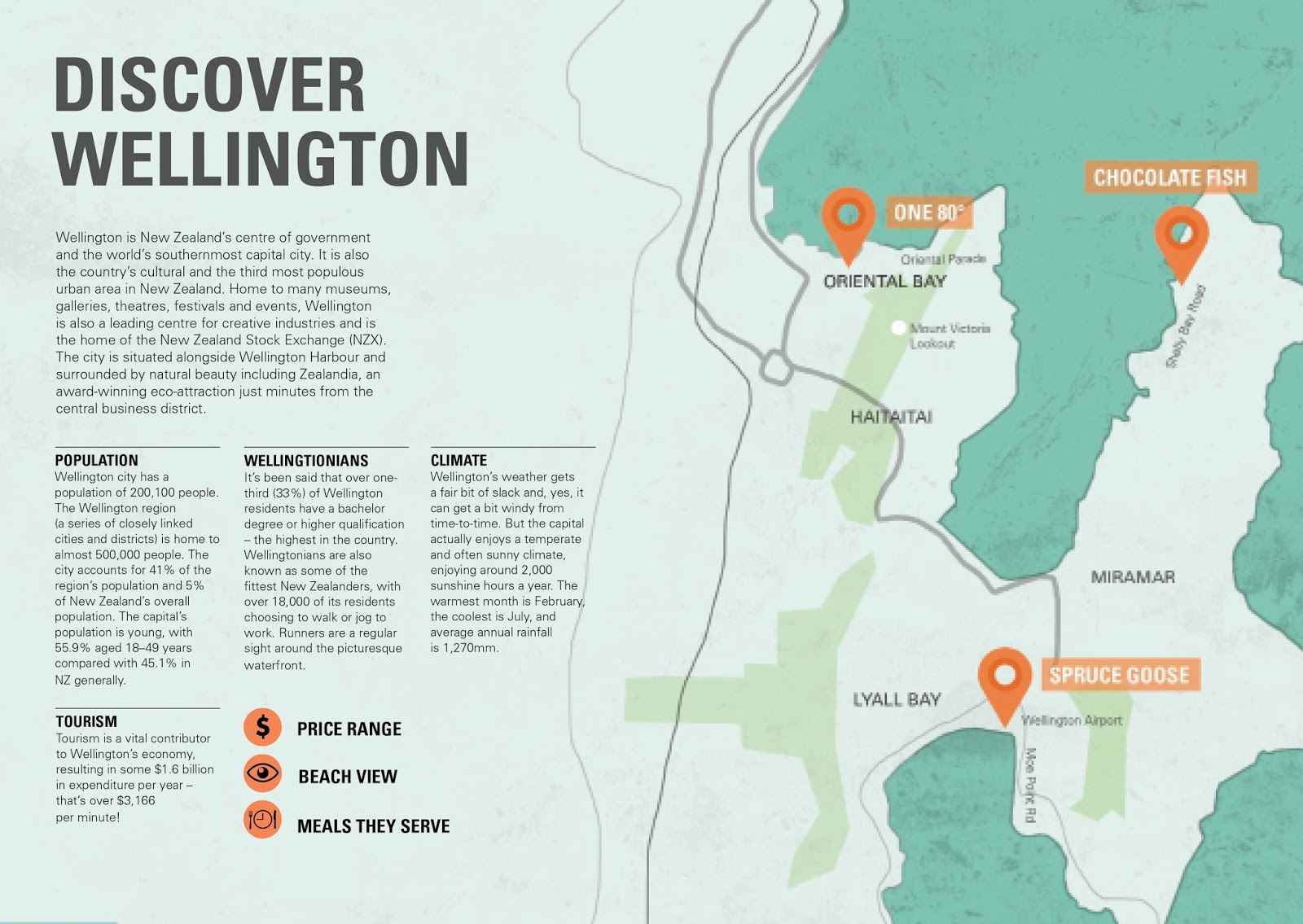
Today we worked on our maps. We quickly sketched up our current map on a piece of napkin to see if others could follow it. Looking at my map I made through photoshop, I think you can clearly identify how far apart my 3 locations are. Since my locations are very far apart, I don't need to include all the street names, only the ones relevant to my location. I don't think it's necessary to having a key to determine where my locations are. I already have a map marker symbol along with the cafe/restaurant name.

To ensure that my map fits the overall style of my brochures, I made the ocean that surrounds the locations blue to match my current color palette. I also wanted my map to flow across the spread. The black lines I've drawn may not be so useful in terms of navigation so i'll have to redo the lines so that it makes somewhat more sense to the reader.


I included the street names of my location and changed the font of the names of the eateries to match the heading.

Friday, 10 March 2017

Week 3 - Session 1

Critique:

After showing my compositions to Lee, she said I was heading in the right direction, which was good to here because I was questioning if my collages were strongly communicating my theme and 3 locations. We also looked at grids and began sketching thumbnails of compositions for our text using the columns provided, and how our imagery can be placed with the text. I'll be working with a portrait template as I think it's most suitable for my designs.

For each spread, I plan to have a:
  • Heading
  • Subheading that briefly describes the place
  • Contact info (address - phone - hours)
  • Information of each cafe.   
  • My 3 secondary communication points:
    • Price range (cheap - mid-range- and costly) 
    • View of (Wellington Harbour, Lyall Bay beach, Shelly Bay Beach)
    • Types of meal they serve throughout the day (Breakfast, Lunch, Dinner)